
In the ever-evolving world of web design, efficiency, usability, and user experience are paramount. One element that has gained prominence in recent years is the modal.
But what is a modal, and why should it matter to you as a web designer or developer? In this comprehensive guide, we’ll dive into the concept of modal, their applications, and best practices for using them effectively.
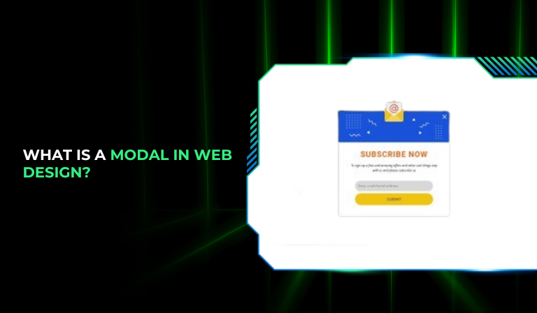
What Is a Modal?

A modal is a user interface element that appears on top of the main content of a webpage or application, creating a temporary interaction layer.
It is designed to focus the user’s attention on a specific task or piece of information, often requiring a response before they can return to the main content.
Modals can take various forms, such as dialogs, pop-ups, or lightboxes, and are commonly used for interactions like confirmations, forms, and alerts.
Key Characteristics of a Modal:
Overlay: Modals usually include an overlay or backdrop that dims the main content to emphasize the modal window.
Focus: They are intended to focus the user’s attention on a single task or piece of information.
Interaction: Users typically need to interact with the modal (e.g., make a choice or input data) before they can return to the main content.
Dismissibility: Modals can usually be dismissed by clicking a close button, clicking outside the modal, or completing the action within the modal.
Types of Modals
Modals can be categorized based on their functionality and design. Here are some common types:
1. Alert Modals
Alert modals are used to convey important information or warnings to users. They often include a message and a single button to acknowledge the alert.
Example: A notification informing users about an error that occurred during form submission.
2. Confirmation Modals
Confirmation modals prompt users to confirm or cancel an action. They are often used for actions that have significant consequences, such as deleting a file or submitting a form.
Example: A dialog box asking users to confirm their decision to delete a post.
3. Input Modals
Input modals request user input or data. They typically contain forms where users can enter information or make selections.
Example: A login form or a subscription sign-up form.
4. Information Modals
Information modals provide additional details or context without requiring immediate action. They are often used to offer help or additional information.
Example: A modal explaining the terms and conditions of a service.
5. Lightbox Modals
Lightbox modals are used to display images or videos in a larger view while dimming the background content. They are popular in galleries and media-heavy sites.
Example: Clicking on a thumbnail image to view it in full-screen mode.
How Do Modals Work?
Modals work by overlaying a separate layer on top of the main content, usually with a semi-transparent backdrop that dims the underlying content. This overlay helps users focus on the modal’s content and action.
Here’s a step-by-step breakdown of how modals typically work:
1. Triggering the Modal
A modal is activated by user interaction, such as clicking a button, link, or icon. This action triggers a script or function that displays the modal.
Example: Clicking a “Sign Up” button might open a modal with a registration form.
2. Displaying the Modal
Once triggered, the modal appears on top of the current content, often with an animation or transition effect. The backdrop or overlay dims the main content to highlight the modal.
Example: A fade-in effect as the modal appears, making the transition smooth and less jarring.
3. User Interaction
The user interacts with the modal by providing input, making a selection, or reading information. The modal usually includes buttons for common actions like “Submit,” “Cancel,” or “Close.”
Example: A user filling out a form in a modal and clicking “Submit” to send the information.
4. Dismissing the Modal
The modal can be closed or dismissed by clicking a close button (often an “X” icon), clicking outside the modal area, or completing the action within the modal. Dismissing the modal typically returns the user to the main content.
Example: Clicking the close button in the upper-right corner of the modal to return to the main page.
Best Practices for Using Modals
To ensure modals enhance user experience rather than detract from it, follow these best practices:
1. Ensure Accessibility
Modals should be accessible to all users, including those using screen readers and keyboard navigation. Implement proper ARIA (Accessible Rich Internet Applications) attributes and ensure the modal is focusable.
Tips for Accessibility:
- Use aria-labelledby to associate the modal with its title.
- Ensure that the modal can be navigated using the keyboard (e.g., Tab key).
- Provide a clear focus trap so users don’t accidentally tab out of the modal.
2. Design for Usability
Design modals to be user-friendly and visually appealing. Avoid clutter and ensure that the content is easy to read and interact with.
Design Tips:
- Use a clear and concise title for the modal.
- Ensure buttons and form fields are appropriately sized for easy interaction.
- Maintain consistent styling with your website’s design.
3. Limit the Use of Modals
Overusing modals can lead to a frustrating user experience. Use them sparingly and only for important interactions or information.
Considerations:
- Avoid using modals for non-essential content or frequent notifications.
- Consider alternative methods, such as in-page notifications or tooltips, for less critical information.
4. Provide Clear Actions
Ensure that modals include clear and actionable buttons or links. Users should easily understand how to proceed or dismiss the modal.
Action Tips:
- Label buttons with descriptive text (e.g., “Save Changes” instead of “OK”).
- Provide an obvious “Close” button for dismissing the modal.
5. Test Across Devices and Browsers
Test modals across various devices and browsers to ensure they function correctly and look consistent. Responsive design and cross-browser compatibility are essential for a smooth user experience.
Testing Tips:
- Check modal performance on mobile devices, tablets, and desktops.
- Ensure compatibility with popular web browsers, including Chrome, Firefox, Safari, and Edge.
FAQs
1. What is a modal in web design?
A modal is a user interface element that appears on top of the main content of a webpage or application, often requiring user interaction before returning to the main content. It is used for tasks like confirmations, forms, alerts, and additional information.
2. How do I implement a modal on my website?
To implement a modal, you need to use HTML, CSS, and JavaScript. HTML provides the structure of the modal, CSS styles it, and JavaScript handles the functionality, such as showing and hiding the modal.
Basic Steps:
- Create the modal structure in HTML.
- Style the modal with CSS for positioning and appearance.
- Use JavaScript to handle modal visibility and interactions.
3. Are there any accessibility considerations for modals?
Yes, accessibility is crucial for modals. Ensure that modals are accessible to users with disabilities by implementing ARIA attributes, enabling keyboard navigation, and providing clear focus management.
4. What are some common use cases for modals?
Common use cases for modals include:
Alerts: Informing users of important information or errors.
Confirmations: Asking users to confirm actions, such as deletions.
Forms: Collecting user input or data.
Information: Providing additional details or help.
Media: Displaying images or videos in a larger view.
5. Can I use modals on mobile devices?
Yes, modals can be used on mobile devices, but they should be designed with responsiveness in mind. Ensure that modals are touch-friendly and display correctly on various screen sizes.
6. How can I avoid modal overuse?
To avoid overusing modals, prioritize their use for critical interactions or important information. For less significant content, consider using other UI elements like tooltips, in-page notifications, or expandable sections.
7. Are there any libraries or frameworks for creating modals?
Yes, there are several libraries and frameworks that provide pre-built modal components, including Bootstrap, jQuery UI, and Materialize. These can simplify the process of implementing modals with customizable options.
Conclusion
Understanding what is a modal and how to use it effectively is essential for modern web design. Modals offer a versatile way to enhance user interaction by focusing attention on specific tasks or information.
By following best practices for accessibility, usability, and design, you can create modals that improve the user experience and contribute to the overall success of your website or application.
Whether you’re designing a new feature or optimizing an existing one, incorporating well-designed modals can elevate your site’s functionality and user satisfaction.
Start implementing these strategies and watch how effective modals can transform your web design approach.


