


When you’re planning a website, choosing the right design type feels like standing at a crossroads. Pick the wrong one, and your users might struggle to navigate, or your site could look terrible on mobile devices. But pick the right one, and you’ll create a smooth, enjoyable experience that keeps people coming back.

Think of web design types like different types of houses. Some are rigid and structured, others are flexible and adapt to their surroundings. Each has its place, and understanding which one suits your needs can save you time, money, and frustration down the road.
What Are Web Design Layouts?
Web design layouts are essentially the blueprint of your website. They determine how your content is arranged, how it responds to different screen sizes, and how users interact with your pages. Just like you wouldn’t use the same blueprint for a tiny studio apartment and a sprawling mansion, different websites need different layout approaches.
The layout you choose affects everything from loading speed to user experience to how well your site performs in search engines.
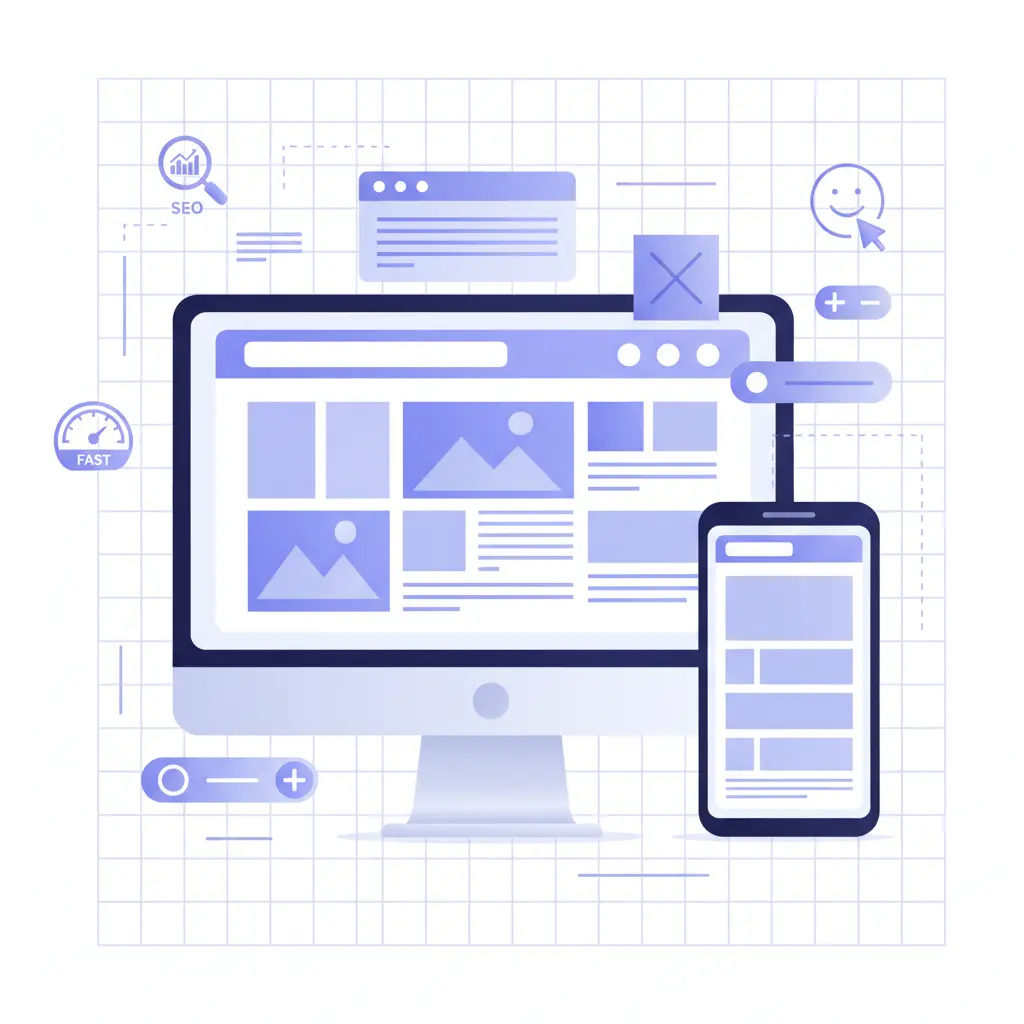
6 Web Design Types at a Glance
| Layout Type | Best For | Mobile Friendly | Complexity | Cost |
| Static | Simple portfolios, landing pages | No | Low | Low |
| Liquid | Content-heavy sites | Partially | Medium | Medium |
| Adaptive | E-commerce, membership sites | Yes | Medium | Medium |
| Dynamic | Social networks, personalized content | Yes | High | High |
| Responsive | Most modern websites | Yes | High | Medium |
| Single Page | Events, portfolios, product launches | Yes | Low | Low |
1. Static Page Layout
Static layouts are like that reliable old friend who never changes. They have fixed dimensions and display the same way no matter what device you’re using. These sites are built with basic HTML and CSS, making them straightforward to create and maintain.
Imagine a printed brochure – it looks exactly the same whether you view it on a table or hold it close to your face. That’s essentially how static layouts work.
Pros:
- Super easy and quick to set up
- Loads incredibly fast
- Very affordable to build
- Perfect for simple informational sites
Cons:
- Looks terrible on mobile devices
- Not user-friendly in today’s mobile-first world
- Requires building a separate mobile version
- Feels outdated to modern users
Best for: Simple business cards online, basic portfolios, or temporary landing pages where mobile traffic isn’t a concern.
2. Liquid (Fluid) Layout
Liquid layouts are like stretchy fabric – they expand and contract to fit whatever space they’re given. Instead of using fixed pixel measurements, they use percentages, so your content always fills the screen width.
Picture a rubber balloon that changes shape when you squeeze it from different sides. That’s how liquid layouts behave across different screen sizes.
Pros:
- Adapts to any screen width
- No content gets cut off
- More flexible than static layouts
- Good for content-heavy websites
Cons:
- Can look weird on very wide screens (text stretches too far)
- Content gets squished on small screens, making it hard to read
- Limited control over how things look
- Can create awkward white space
Best for: Blogs, news sites, or content platforms where readability across different desktop screen sizes matters more than perfect visual control.
3. Adaptive Website Layout
Adaptive design is like having several different outfits for different occasions. It creates multiple fixed layouts and chooses the best one based on the user’s screen size. Using CSS queries, it detects whether someone is on a phone, tablet, or desktop and serves up the appropriate version.
Think of it as having a closet with a casual outfit, business attire, and formal wear – you pick the right one for the situation.
Pros:
- Gives you precise control over how your site looks on each device
- Faster to develop than fully responsive sites
- Great user experience on targeted devices
- Can optimize performance for each screen size
Cons:
- Only looks perfect at predetermined screen sizes
- Weird spacing issues can happen on in-between screen sizes
- Requires more initial planning and setup
- More files to maintain
Best for: E-commerce sites, membership platforms, or businesses where you need pixel-perfect control over the user experience on specific devices.
Also Check: The Best 404 Pages: 30 Most Creative Examples
4. Dynamic Website Layout
Dynamic layouts are like having a personal assistant who customizes everything based on what you need. These sites pull information from databases and create pages on the fly based on user interactions, preferences, or other data.
Imagine walking into a restaurant where the menu changes based on your dietary preferences, the time of day, and what ingredients are fresh. That’s the power of dynamic layouts.
Pros:
- Highly personalized user experiences
- Content updates automatically
- Great for user engagement and interaction
- Can display different content to different users
- Scalable for large amounts of content
Cons:
- More complex to set up and maintain
- Slower loading times due to database queries
- Requires more technical expertise
- Higher development and hosting costs
Best for: Social media platforms, online stores with user accounts, news sites with personalized content, or any site where user interaction and personalization are key.
5. Responsive Design Layout
Responsive design is like water – it takes the shape of whatever container it’s in, but it always remains perfectly functional. This approach uses flexible grids, images, and CSS media queries to create one design that works beautifully on all devices.
It’s like having a transformer robot that seamlessly changes form while maintaining all its core functionality.
Pros:
- One website that works perfectly everywhere
- Best user experience across all devices
- Better for SEO (Google loves mobile-friendly sites)
- Future-proof as new devices emerge
- Cost-effective in the long run
Cons:
- Takes more time and skill to develop properly
- Can be more expensive upfront
- Some design compromises necessary to work everywhere
- Complex planning required
Best for: Almost every modern website, especially if you want to reach users across all devices and don’t want to maintain multiple versions.
6. Single Page Layout
Single page layouts are like reading a really long, engaging magazine article – everything flows from top to bottom in one continuous experience. Users scroll down to discover your content rather than clicking through multiple pages.
Think of it as telling your entire story in one smooth, uninterrupted narrative.
Pros:
- Simple and clean user experience
- Great for storytelling and guiding users through a journey
- Mobile-friendly by nature
- Easy to create and maintain
- Perfect for focused campaigns
Cons:
- Not suitable for content-heavy websites
- Can become overwhelming if too long
- Limited SEO opportunities (only one page to optimize)
- Not ideal for complex navigation needs
Best for: Portfolio sites, product launches, event pages, restaurants, or any business with a simple, focused message.
Choosing the Right Web Design Type for Your Business
Picking the right layout isn’t just about what looks cool – it’s about matching your business goals with your users’ needs. Here’s a simple way to think about it:
Ask yourself these questions:
- Who is your target audience, and how do they browse the web?
- What’s your budget for initial development and ongoing maintenance?
- Do you need to sell products online or just share information?
- How often will you need to update content?
- What devices do your customers use most?
Quick decision framework:
- Need something fast and cheap? Consider static or single page
- Want to sell products online? Go with responsive or adaptive
- Have lots of content that changes frequently? Dynamic is your friend
- Serving a mobile-heavy audience? Responsive is essential
- Want complete control over every detail? Adaptive gives you that power
Frequently Asked Questions
1. What’s the difference between adaptive and responsive design?
Adaptive design creates separate layouts for different screen sizes, while responsive design uses one flexible layout that adapts smoothly to any screen size.
2. Which layout type is best for SEO?
Responsive design typically performs best for SEO because it provides a consistent URL structure and user experience across all devices, which Google favors.
3. Can I change my layout type after launching my website?
Yes, but it usually requires rebuilding significant portions of your site. It’s much easier and cost-effective to choose the right layout from the beginning.
4. Do I need a separate mobile site with static layouts?
If you choose static layout, yes – you’ll need a separate mobile version to provide a good user experience for smartphone users.
Pro Tips & Best Practices
Start with your users in mind. Before falling in love with any particular design approach, understand how your audience behaves online. Do they browse mostly on phones? Do they need to access complex information quickly?
- Don’t sacrifice speed for flashy features. Users will abandon slow-loading sites faster than you can say “dynamic content.” Sometimes simpler is better.
- Plan for the future. Choose a layout that can grow with your business. What works for a small startup might not work when you’re processing hundreds of orders per day.
- Test on real devices. Don’t just resize your browser window – actually test your site on different phones, tablets, and computers to see how it really performs.
- Keep mobile users happy. With over 58% of web traffic coming from mobile devices, ignoring mobile experience is like closing your doors to half your potential customers.
Conclusion
Choosing the right web design type isn’t about following the latest trends – it’s about creating the best possible experience for your specific users and business goals. Whether you go with the reliability of static layouts, the flexibility of responsive design, or the personalization power of dynamic sites, the key is matching your choice to your real-world needs.
Remember, your website is often the first impression people have of your business. Make it count by choosing a design approach that serves your users well and supports your business objectives for years to come.

Passionate about blogging and focused on elevating brand visibility through strategic SEO and digital marketing. Always tuned in to the latest trends, I’m dedicated to maximizing engagement and delivering measurable ROI in the dynamic world of digital marketing. Let’s connect and unlock new opportunities together!