

Ever found yourself endlessly scrolling through Netflix, overwhelmed by the sheer number of choices?
You’re not alone! It’s a common experience in our streaming-saturated world.
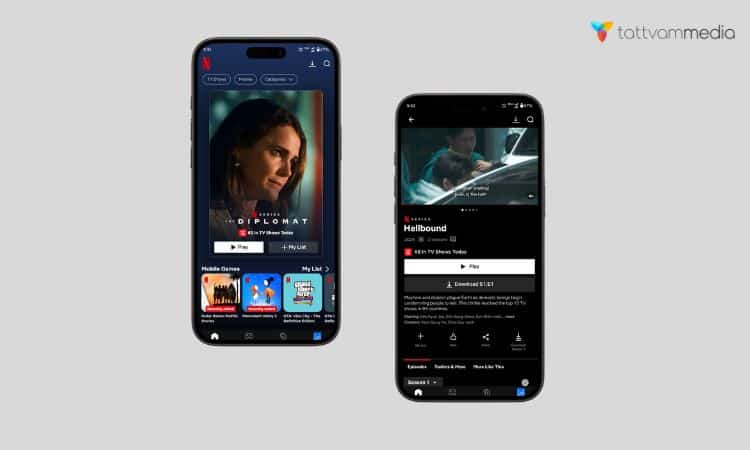
But have you ever noticed how the artwork for shows and movies seems to change, sometimes even featuring different characters or scenes?
Well, my friend, that’s not just random chance – it’s Netflix’s secret weapon in the battle for your attention.
In the world of web design, understanding how to create a compelling user experience (UX) and user interface (UI) is crucial. Netflix, a leader in streaming services, offers valuable lessons through its artwork personalization strategies.
Today, we’re diving into the fascinating world of Netflix’s artwork personalization strategy.
Trust me, it’s cooler than it sounds! We’ll unpack how this streaming giant uses clever tech and a dash of creativity to make your browsing experience feel tailor-made.
So grab your popcorn, and let’s get started!
What Is Netflix Artwork Personalization?
Netflix has revolutionized the way streaming platforms use artwork personalization. This approach involves tailoring the images and visuals displayed to each user based on their viewing history and preferences.
How Netflix Uses Artwork Personalization
Now, let’s peek behind the curtain and see how this magic happens. Netflix used to show the same artwork to everyone – can you imagine? But they’ve seriously upped their game since then.
These days, they use something called “contextual bandits” to personalize the artwork. I know, it sounds like a group of tech-savvy outlaws, but it’s actually a super smart algorithm. It’s like having a friend who knows your taste in shows better than you do!
The algorithm considers all sorts of things about you:
- What you’ve watched before
- What time of day you’re browsing
- What device you’re using
- Even what day of the week it is!
It then uses this info to pick the artwork that’s most likely to catch your eye. And here’s the kicker – it’s always learning. Every time you click (or don’t click) on a title, it’s taking notes. Netflix calls this the “take rate,” and it’s crucial in figuring out what works for you.
Simplicity: The Art of Keeping It Simple
Now, let’s talk about Netflix’s design philosophy: Keep. It. Simple.
Clean Visual Hierarchy: Easy on the Eyes
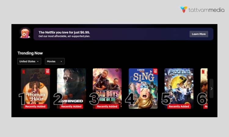
Netflix’s interface is like a well-organized closet. Everything has its place, and you can find what you need without digging through a mess.
They use a clear visual hierarchy to guide your eye:
- Big, bold titles for the main sections
- Smaller, but still clear, text for show titles
- Neat rows of thumbnails that you can easily scroll through
And have you noticed how much black space there is? That’s not laziness; it’s intentional! The dark background makes the colorful thumbnails pop and reduces eye strain during those late-night binge sessions. (We’ve all been there, no judgment!)
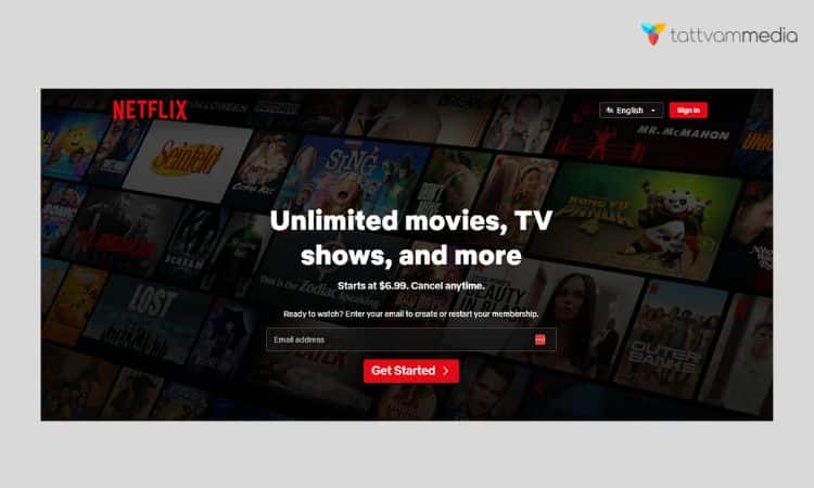
Streamlined Onboarding and Navigation
Remember when signing up for a new service felt like filling out tax forms? Not with Netflix! Their onboarding process is smoother than butter:
- Enter your email
- Choose a plan
- Set up payment
- Start watching!
And once you’re in, finding your way around is a breeze. The main navigation is always at the top, search is prominently displayed, and your personalized recommendations are front and center.
Pro tip for other platforms: Keep it simple! Minimize steps, use clear labels, and always show users where they are and where they can go next.
Showcasing Original Content: Netflix’s Crown Jewels
Netflix isn’t shy about promoting its original shows and movies. And why should they be? These originals are what set them apart from the competition.
Strategic Placement: Front and Center
Next time you open Netflix, take a look at the top of your screen. Chances are, you’ll see a big, splashy promotion for a Netflix original. It might even start playing a trailer automatically. (Love it or hate it, it definitely grabs your attention!)
They also sprinkle originals throughout the content rows, often with special badges or distinctive artwork. It’s like they’re saying, “Hey, this is special. You can only watch this here!”
Adding Value: More Than Just Shows
Netflix’s original content isn’t just about having exclusive shows. It’s about creating cultural moments. Remember when everyone was talking about “Tiger King” or “Squid Game”? That buzz keeps people subscribed and talking about Netflix.
For other platforms, the lesson is clear: Highlight what makes you unique. Whether it’s exclusive content, special features, or a unique service, make sure your users know about it!
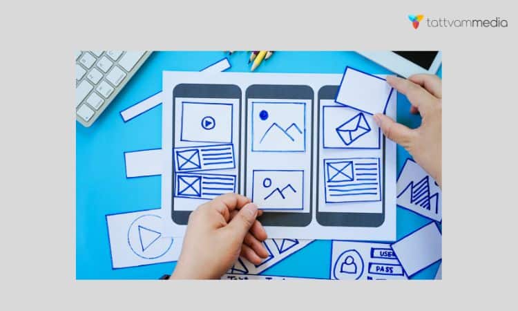
What Is UI Design?
UI Design (User Interface Design) is all about creating the visual elements of a website or application that users interact with. This includes everything from buttons and menus to layout and color schemes.
The goal of UI design is to make these elements as intuitive and enjoyable as possible for users.
Key Principles of UI Design
- Consistency: Ensuring that similar elements behave in the same way throughout the site.
- Clarity: Make sure that the interface is easy to understand and use.
- Responsiveness: Designing elements that work well on various devices and screen sizes.
- Aesthetics: Creating a visually appealing interface that aligns with the brand’s identity.
UI design is essential because it affects how users interact with and perceive a website or application. Good UI design helps users find what they need quickly and efficiently.
What Is UX Design?
UX Design (User Experience Design) focuses on the overall experience a user has when interacting with a website or application.
It’s about understanding the user’s needs, behaviors, and motivations to create a seamless and satisfying experience.
Key Principles of UX Design
- User-Centric: Designing with the user’s needs and preferences in mind.
- Usability: Ensuring the website or app is easy to use and navigate.
- Accessibility: Making sure that the design is usable by people with various abilities and disabilities.
- Flow: Creating a smooth and logical progression through the content or features.
UX design is crucial because it influences how users feel about and engage with a product. A positive user experience can lead to higher satisfaction and increased loyalty.
The Role of UX in Netflix’s Artwork Personalization
Netflix’s artwork personalization strategy greatly enhances the user experience. Here’s how:
How Personalized Artwork Enhances User Experience
- Increased Relevance: Users are more likely to engage with content that is visually appealing and relevant to their interests.
- Enhanced Engagement: By presenting content in a way that resonates with users, Netflix encourages more interaction and longer viewing times.
- User Satisfaction: Personalized artwork makes users feel that Netflix understands their preferences, leading to a more satisfying experience.
Impact on User Engagement and Satisfaction
Personalized artwork has been shown to increase user engagement by making the content more enticing. When users see visuals that align with their interests, they are more likely to click on and watch the content. This leads to higher satisfaction and a stronger connection to the platform.
Examples of Successful UX Strategies from Netflix
- Tailored Recommendations: Netflix uses viewing history to recommend shows and movies, enhancing the user’s experience by presenting content they are likely to enjoy.
- Personalized Banners: The platform displays different banners for the same show based on what it predicts will be most engaging for each user.
The Role of UI in Netflix’s Artwork Personalization
UI design plays a crucial role in how personalized artwork is presented. Here’s a closer look:
Design Elements Used in Personalized Artwork
- Visual Appeal: Netflix uses high-quality images and engaging visuals to capture users’ attention.
- Layout: The arrangement of artwork and content on the screen is designed to make it easy for users to find and interact with their favorite shows and movies.
- Interactive Elements: Buttons and links are designed to be easily accessible and intuitive to use.
How UI Design Influences Visual Appeal and User Interaction
The effectiveness of personalized artwork relies heavily on UI design. A well-designed UI ensures that artwork is displayed in a way that is both visually appealing and functional.
This includes using appropriate sizes, layouts, and interactive elements to enhance the user’s experience.
Examples of Effective UI Techniques from Netflix
- Adaptive Thumbnails: Netflix uses different thumbnails for the same content based on user preferences, ensuring that the most relevant visual is always shown.
- Hover Effects: When users hover over artwork, additional information or previews are displayed, making it easier to decide whether to watch the content.
Key Lessons for UX Design
Netflix’s approach to artwork personalization offers several valuable lessons for UX design:
Importance of Personalization in UX
- Relevance: Personalized content increases relevance, making users feel more connected to the platform.
- Engagement: Tailoring the user experience to individual preferences can lead to higher engagement and satisfaction.
- Retention: A personalized experience helps keep users coming back by continually offering content that matches their interests.
Strategies for Implementing Personalization in UX Design
- Data Analysis: Use data to understand user preferences and tailor the experience accordingly.
- User Feedback: Gather feedback from users to refine and improve personalization strategies.
- A/B Testing: Test different personalization approaches to determine what works best.
Case Studies or Examples from Other Industries
- E-Commerce: Online stores like Amazon use personalized recommendations to enhance the shopping experience.
- News Websites: Platforms like Google News use algorithms to show articles that match users’ reading habits and interests.
Key Lessons for UI Design
Netflix’s UI design strategies also provide key lessons for creating effective user interfaces:
Principles of Effective UI Design Highlighted by Netflix’s Approach
- Visual Hierarchy: Use design elements to guide users’ attention to the most important content.
- Clarity: Ensure that interactive elements are easy to understand and use.
- Responsiveness: Design UI elements that work well on various devices and screen sizes.
Tips for Incorporating Personalized Elements in UI
- Dynamic Content: Use dynamic elements that adapt based on user preferences and behavior.
- Consistent Design: Maintain a consistent design language across different personalized elements to ensure a cohesive experience.
- User Testing: Regularly test personalized UI elements to ensure they meet user needs and expectations.
Case Studies or Examples from Other Industries
- Social Media: Platforms like Facebook and Instagram use personalized feeds to keep users engaged.
- Streaming Services: Other streaming services, like Hulu, also use personalized artwork to attract viewers.
Combining UX and UI: Best Practices
Integrating UX and UI design principles is essential for creating a cohesive and effective user experience. Here’s how to do it:
How to Integrate UX and UI Design Principles for a Cohesive Experience
- Align Goals: Ensure that UX and UI goals are aligned to create a seamless user experience.
- Collaborate: Encourage collaboration between UX and UI designers to address both functional and aesthetic aspects.
- Consistency: Maintain consistency in design elements to provide a unified experience across different parts of the platform.
Balancing Personalization with Usability and Design Consistency
- User Needs: Focus on meeting user needs while implementing personalization.
- Design Standards: Adhere to design standards to ensure consistency and usability.
- Feedback: Collect and use user feedback to balance personalization with overall design goals.
Practical Tips for Designers and Developers
- Regular Updates: Continuously update and refine personalization strategies based on user data and feedback.
- Test and Iterate: Regularly test different design approaches and iterate based on results.
- Stay Informed: Keep up with the latest trends and best practices in UX and UI design.
FAQ’s (Frequently Asked Questions)
Q. How does Netflix personalize the user experience?
Netflix gathers extensive data on user behaviour, including viewing history, ratings, searches, rewinds, and rewatches. This data fuels its powerful recommendation engine, powered by algorithms that employ methods such as collaborative filtering, content-based filtering, and hybrid approaches [Note: Information about different types of recommendation algorithms is not explicitly mentioned in the sources, but it’s widely known in the field of recommendation systems]. The platform also employs “artwork personalization,” tailoring thumbnail images to individual tastes, further enhancing personalization.
Q. Does Netflix use data to refine its design?
Absolutely! Netflix is a champion of data-driven design, constantly employing A/B testing to optimise its platform. By comparing different versions of design elements and tracking user interactions, they identify the most effective options and implement them for an improved user experience.
Q. How does Netflix’s rating system work?
Netflix currently uses a binary “thumbs up” and “thumbs down” rating system, replacing the earlier star-rating system. This simplified approach encourages more user feedback, which in turn strengthens personalization algorithms and influences content recommendations.
Conclusion
Netflix’s artwork personalization strategy offers valuable insights into effective UX and UI design.
By understanding how Netflix uses personalized visuals to enhance user engagement and satisfaction, we can apply these lessons to our own web design projects.
Focusing on relevance, clarity, and user-centered design will help create a more engaging and satisfying experience for users.

Passionate about blogging and focused on elevating brand visibility through strategic SEO and digital marketing. Always tuned in to the latest trends, I’m dedicated to maximizing engagement and delivering measurable ROI in the dynamic world of digital marketing. Let’s connect and unlock new opportunities together!