



Mobile devices now dominate how people browse, search, and interact online. With Google’s mobile-first indexing and user experience metrics like Interaction to Next Paint (INP), optimizing websites for mobile users is no longer optional. This in-depth guide explains mobile SEO, why it matters, and how to implement mobile SEO optimization effectively. You’ll learn practical strategies, technical best practices, content guidelines, and performance improvements to optimise website mobile SEO and stay competitive in mobile search results.

Why Mobile SEO Is No Longer Optional
More than half of global website traffic now comes from mobile devices, and in many industries, that number is significantly higher. Users rely on smartphones for everything from quick searches to high-intent actions like booking services or making purchases.
This shift has fundamentally changed how websites should be designed, developed, and optimized. Google has officially moved to mobile-first indexing, meaning it primarily evaluates the mobile version of your website for ranking and indexing.
If your website is slow, difficult to navigate, or hard to read on mobile devices, your rankings, traffic, and conversions will suffer. This is where mobile search engine optimization plays a critical role.
What Is Mobile SEO?
Mobile SEO is the process of optimizing a website to ensure it performs well in mobile search results and delivers a seamless user experience on smartphones and tablets.
While traditional SEO focuses on keywords, backlinks, and content relevance, SEO for mobile sites adds extra layers of technical and usability optimization, such as:
-
Mobile-friendly layouts
-
Fast loading speeds on cellular networks
-
Touch-friendly navigation
-
Readable content on small screens
-
Optimized interactivity and responsiveness
In simple terms, mobile SEO ensures that your website is not just visible on mobile devices, but also usable, fast, and engaging.
Why Mobile SEO Is Critically Important
1. Mobile-First Indexing
Google now crawls and indexes websites based on their mobile version. If your mobile site lacks content, structured data, or proper internal linking, your rankings can drop even if your desktop site is well optimized.
2. User Experience Drives Rankings
Search engines increasingly rely on user experience signals. Slow load times, unresponsive buttons, or intrusive pop-ups can negatively affect engagement and visibility.
3. Higher Conversion Potential
A mobile-optimized website makes it easier for users to call, fill forms, add products to cart, or navigate service pages, directly impacting revenue.
Understanding Your Mobile Traffic
Before improving mobile SEO, it’s essential to understand how much of your traffic comes from mobile users and how they behave.
Mobile vs Desktop Usage
Different industries show different patterns. For example:
-
Local services often receive high mobile traffic
-
B2B websites may still see more desktop usage
-
Ecommerce and content websites are increasingly mobile-dominated
Regardless of current trends, mobile usage continues to grow, making mobile search SEO a future-proof strategy.
Analyzing Mobile Data
Using analytics tools, you can analyze:
-
Mobile vs desktop traffic share
-
Bounce rates on mobile pages
-
Conversion rates by device
-
Page performance on mobile
This data helps prioritize which pages need urgent mobile optimization.
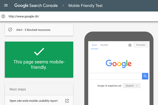
How to Check If Your Website Is Mobile-Friendly
Performance and Usability Audits
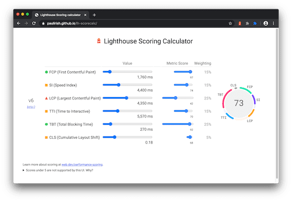
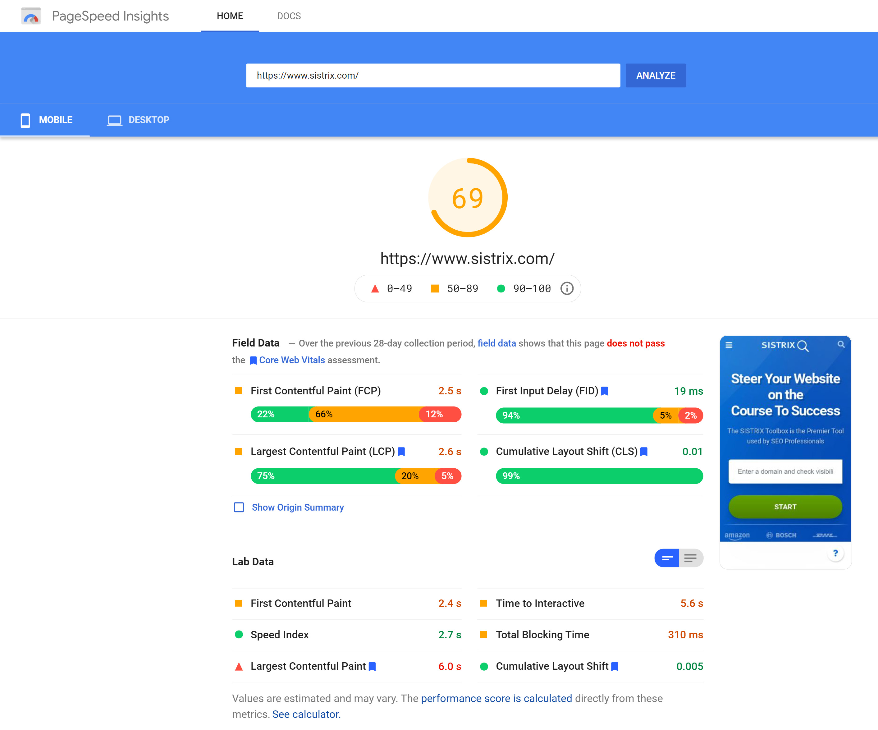
Mobile-friendliness goes beyond responsive design. You should regularly audit:
-
Page load speed
-
Text readability
-
Layout stability
-
Button spacing and navigation
-
Interactivity responsiveness
Core Web Vitals for Mobile
Metrics like Largest Contentful Paint (LCP), Cumulative Layout Shift (CLS), and Interaction to Next Paint (INP) help measure real user experience on mobile devices.
Mobile-First Optimization Strategy
Effective mobile SEO optimization requires a balance of technical improvements, design enhancements, and content adjustments. Collaboration between SEO specialists, developers, and designers is essential.
The goal is to remove friction from the mobile user journey while maintaining search visibility.
Best Practices for Mobile SEO Optimization
1. Responsive vs Dynamic Rendering
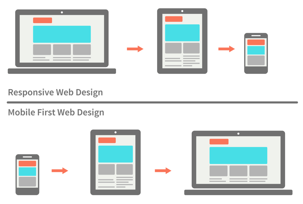

Responsive design automatically adapts layout and content based on screen size. This is the most recommended approach because:
-
One URL serves all devices
-
Easier to maintain
-
Preferred by Google
Dynamic serving, while flexible, requires more technical maintenance and increases the risk of inconsistencies.
2. Interaction to Next Paint (INP)
INP measures how quickly a website responds to user interactions throughout the entire session, not just the first click.
Good INP: under 200ms
Needs improvement: 200–500ms
Poor: over 500ms
Common causes of poor INP:
-
Heavy JavaScript execution
-
Large HTML DOM size
-
Inefficient event handlers
Improving INP directly enhances mobile usability and helps with mobile search engine optimization.
3. Image Optimization for Mobile


Images often account for the majority of page weight. Poorly optimized images slow down mobile websites.
Best practices include:
-
Using responsive image sizes
-
Implementing lazy loading
-
Compressing images with modern formats like WebP
-
Including images in sitemaps
Optimized images improve speed, accessibility, and engagement.
4. Avoid Intrusive Interstitials


Pop-ups that block content on mobile screens frustrate users and harm rankings.
Avoid:
-
Full-screen pop-ups on page load
-
Hard-to-close overlays
-
Auto-triggered pop-ups without user action
Instead, use subtle banners or user-initiated interactions.
5. Structured Data for Mobile SERPs
Structured data helps search engines understand your content and display rich results like:
-
Product listings
-
Reviews
-
Local business information
Using JSON-LD markup enhances visibility and click-through rates, especially on mobile SERPs where space is limited.
6. Mobile-Friendly Content Style

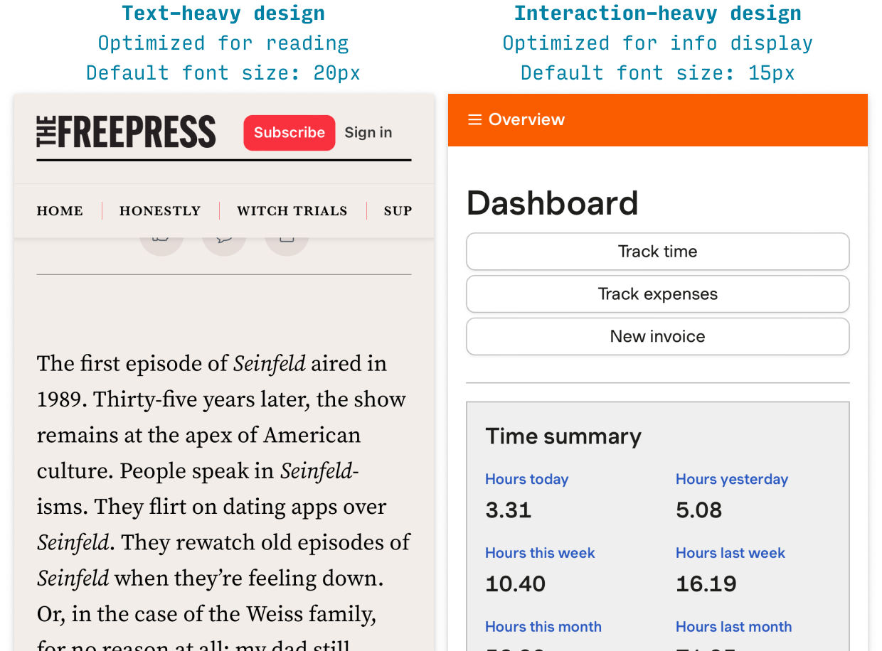
Mobile users skim rather than read deeply. Content should be:
-
Broken into short paragraphs
-
Structured with clear headings
-
Written in simple, direct language
Font sizes should adapt automatically, and line spacing should reduce eye strain.
7. Tap Targets and Navigation
Buttons, links, and form fields must be easy to tap with a finger.
Best practices:
-
Minimum 48×48 pixel tap area
-
Adequate spacing between elements
-
Clear visual feedback on taps
Poor navigation can destroy conversions, especially for ecommerce and lead-generation sites.
Also Read: Kajaria Tiles Offices in India
Mobile SEO Optimization Priority Checklist
-
Fix responsive layout issues
-
Improve page speed and INP
-
Optimize images and media
-
Improve content readability
-
Fix tap targets and navigation
-
Add structured data
Common Mobile SEO Mistakes to Avoid
-
Designing only for desktop users
-
Ignoring Core Web Vitals
-
Using heavy scripts unnecessarily
-
Overusing pop-ups
-
Publishing unreadable mobile content
Avoiding these mistakes strengthens your mobile search SEO strategy.
Future of Mobile SEO
Mobile SEO will continue evolving with:
-
Faster mobile networks
-
Increased UX-based ranking signals
-
AI-driven search results
-
Voice and visual search growth
Websites that invest in mobile SEO services now will remain competitive long-term.
FAQs
What is mobile SEO optimization?
Mobile SEO optimization is the process of improving a website’s performance, usability, and visibility specifically for mobile users.
How is mobile SEO different from desktop SEO?
Mobile SEO focuses more on speed, responsiveness, interactivity, and usability, while desktop SEO emphasizes screen space and traditional navigation.
Is responsive design enough for mobile SEO?
Responsive design is essential, but not enough. You also need performance optimization, content adjustments, and usability improvements.
How long does mobile SEO take to show results?
Technical improvements can show impact quickly, while content and ranking improvements usually take weeks or months.
Do I need professional mobile SEO services?
For complex websites or competitive industries, professional mobile SEO services can help implement advanced optimization faster and more effectively.
Conclusion
Mobile users now represent the majority of online audiences, and search engines have adapted accordingly. Mobile search engine optimization is no longer a supplementary strategy; it is the foundation of modern SEO.
By focusing on usability, speed, interactivity, and content clarity, you can optimise website mobile SEO effectively and deliver experiences that both users and search engines value.
If you want to stay visible, competitive, and relevant, investing in SEO for mobile sites today is the smartest decision you can make.