

There’s a specific kind of frustration that comes from running a campaign that looks good on paper and then watching it flatline. The ad creative is solid. The targeting is dialed in. The budget is reasonable. People are clicking. And then they land on the page and… nothing. Bounces. Exits. Maybe a handful of form fills if you’re lucky, but nowhere near what the traffic volume should be producing. The instinct is to blame the ads, adjust the audience, try a different creative. But the ads aren’t the problem. The landing page is.
This happens constantly. Companies pour money into getting people to a page and almost nothing into making that page actually work. And the thing is, landing page optimization isn’t some dark art that only conversion specialists understand. The principles are not that complicated. But you have to actually know what you’re looking for, because a page can look completely professional and still be bleeding conversions from five different places at once.
A 1% conversion rate on a landing page sounds fine until you realize that a well-built page for the same offer, same traffic, same budget, might convert at 4% or 5%. That’s four or five times as many leads or sales. Not from spending more. From building the page properly. That gap is real, and it exists on thousands of live pages right now that nobody is fixing because the team is too busy worrying about impressions and click-through rates.
So let’s talk about what actually makes a landing page convert. Not in the abstract, not in a generic “make sure your CTA is visible” way, but the actual mechanics. What the pages that work have in common, why certain elements kill conversions silently, and what you can do about it without needing to rebuild everything from scratch.
What High Converting Landing Pages Get Right That Most Pages Miss
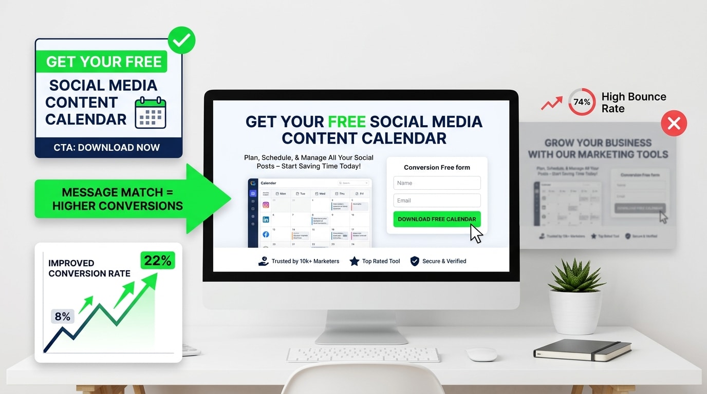
The biggest misconception about landing pages is that conversion is about design. That if the page looks modern, uses good fonts, has a clean layout and some nice imagery, it’ll convert well. Nope. Design matters, but it’s downstream of something more fundamental: the match between what the visitor expected when they clicked and what they find when they land.
This is called message match, and it’s the single most common reason landing pages underperform. Someone clicks an ad that says “Get your free social media content calendar.” They land on a page with a headline that says “Grow Your Business With Our Marketing Tools.” Those two things are not the same. The visitor feels it immediately. Something’s off. The page didn’t deliver on the specific promise that got them to click, so they leave.
Uber used to split test their landing page headlines constantly. Their best-performing version for driver acquisition wasn’t about the company or the app. It was about a specific outcome: “Make money on your schedule.” Five words that spoke directly to the thing the target audience wanted. No preamble. No explanation of what Uber is. Just the promise that mattered.
That’s the level of specificity high converting landing pages operate at. Every element on the page exists to do one thing: advance the visitor toward the conversion. Not to explain the company, not to list every feature, not to demonstrate brand values. Just to get this specific person, who arrived with a specific expectation, to take the one action the page is built for.
The Headline Does More Work Than Any Other Element on the Page
Most headlines are bad. They’re vague, they’re product-focused instead of outcome-focused, and they try to sound clever instead of being clear. Clever is the enemy of conversion. Clear wins every time.
A headline has one job: keep the person on the page long enough to read the next line. That’s it. If the headline doesn’t do that, nothing else on the page matters because nobody is reading any of it.
The best performing headlines tend to do one of a few things. They state a specific outcome (“Build a 6-Month Content Plan in Under an Hour”). They name the exact problem the visitor has (“Tired of Losing Sales Because Your Checkout Is Complicated?”). Or they make a specific, credible claim (“47,000 Businesses Use This Tool to Cut Their Reporting Time in Half”). Notice that all of these are concrete. There’s a number, a specific situation, or a named outcome. Nothing vague.
Basecamp ran a test years ago that became pretty well known in conversion circles. They changed their homepage headline from “Project Management & Group Chat Software” to “Basecamp’s the calm, organized way to manage projects & communicate company-wide.” Conversions went up significantly. Same product, same page structure, different headline. The second version spoke to a feeling (calm, organized) that their target audience desperately wanted.
Subheadlines matter too. A lot of pages use the subheadline to repeat what the headline just said in slightly different words. That’s wasted real estate. The subheadline should add information, not restate it. If the headline makes the promise, the subheadline should say who it’s for, or how it works, or answer the most obvious objection that arises immediately after reading the headline.
How Landing Page Design Actually Affects Conversion Rates
Okay so design does matter, just not in the way most people think. It’s not about looking good. It’s about directing attention.
A visitor who lands on a page has about eight seconds before they’ve decided whether to stay or go. In those eight seconds, their eye is moving around the page following visual hierarchy. Good design controls where that eye goes. Bad design lets the eye wander and land on something irrelevant, and then the visitor loses the thread and leaves.
Visual hierarchy means the most important element on the page, usually the headline and CTA, is the most visually dominant. Everything else is subordinate to those. This sounds obvious but the number of landing pages where the logo, navigation menu, or a decorative image is more visually prominent than the headline is astonishing.
Navigation menus are particularly problematic. On a landing page, every link that takes someone off the page is a potential exit. For a page specifically built for a campaign, removing the navigation entirely typically lifts conversion rates. Unbounce has run this test many times across their platform. Pages without navigation consistently outperform pages with navigation when the goal is a single conversion action.
White space is a trust signal, weirdly. Pages that are dense with text and images feel overwhelming and a little desperate. They feel like someone grabbed your arm and started listing reasons why you should buy. Space gives the eye somewhere to rest and makes the page feel considered and confident. That psychological effect is real.
Color contrast on the CTA button sounds like a tiny detail. It’s not. If the button blends into the page because it’s the same color as surrounding elements, people don’t see it clearly. It doesn’t jump out as an action item. The button should be the highest contrast element on the page relative to its surroundings. That doesn’t mean it needs to be neon orange (though honestly neon orange converts really well), it just means it needs to be visually distinct.
The Copy Below the Fold: Where Most Pages Start Losing People
A lot of landing page advice focuses entirely on the hero section, the above-the-fold experience, and treats everything below it as an afterthought. That’s a mistake. For anything with a longer consideration cycle, like software, services, anything over $100, or anything B2B, the below-the-fold content is where the decision actually gets made.
The visitor glances at the hero, decides the page might be worth reading, and then scrolls. What they find when they scroll is either going to reinforce the decision to convert or introduce doubt.
The structure that tends to work goes roughly like this: problem acknowledgment, solution, social proof, feature/benefit breakdown, more social proof, objection handling, final CTA. That’s not a rigid template, it’s more like the natural arc of a conversation you’d have with someone who’s considering buying.
Problem acknowledgment is often skipped because companies want to get to their solution as fast as possible. That’s understandable but it’s wrong. When a visitor reads copy that describes their problem accurately, something clicks. They feel seen. They trust that whoever wrote this actually understands what they’re dealing with. That trust transfers to the product. Typeform does this well. Their pages often open with a frustration (boring forms that nobody fills out) before pivoting to the solution. It works because it’s honest and specific.
Features versus benefits is a debate that’s been running in copywriting for decades and the answer is still the same: benefits win. A feature is “automated email sequences.” A benefit is “follow up with every lead automatically so nothing falls through the cracks.” The feature describes what the product does. The benefit describes what the user gets. Visitors care about what they get. Write accordingly.
Social Proof and Why Generic Testimonials Are Worthless
Social proof is probably the most discussed element in CRO and also the most frequently done wrong. Slapping five-star reviews on a page is not social proof. It’s decoration. Real social proof is specific, credible, and relevant to the exact concern the visitor has at the moment they’re reading it.
Generic testimonials like “Great product! Highly recommend!” do almost nothing. Nobody believes them. They’ve been burned by fake reviews too many times. The testimonials that actually move the needle are specific about the outcome, mention a real result, and come from someone whose identity matches the visitor’s situation.
“After switching to this tool, our team cut reporting time from four hours a week to 45 minutes” is a good testimonial. Not because it’s glowing, but because it’s specific. There’s a before (four hours), an after (45 minutes), and a real result. Someone reading that can do the math and picture themselves in the same situation.
The source of the testimonial matters as much as the content. A testimonial from “Sarah M.” with no company, no title, no photo is nearly worthless. A testimonial from “Sarah Mitchell, Head of Marketing at Intercom” with a headshot is extremely credible. The more details, the more believable it is.
Case study callouts work well on landing pages when they’re brief and outcome-focused. One or two sentences, a key metric, and a link to the full story if the visitor wants more. “Shopify merchant increased monthly revenue by $40K in 90 days” is the kind of thing that stops a scroll and makes someone read again.
Logo strips showing recognizable company names work for trust building, but only if the logos are actually recognizable to the target audience. A page targeting enterprise software buyers showing Fortune 500 logos is useful. The same logo strip on a page targeting solopreneurs might actually backfire if those companies feel too big and intimidating.
The Call to Action: Getting This Right Changes Everything
The CTA is where people make the decision. Everything else on the page leads to this moment. And a surprising number of landing pages fumble it.
The most common CTA mistake is using weak, generic language. “Submit” is the worst. It sounds like paperwork. “Click here” is lazy. “Sign up” is okay but barely. The best CTAs are specific about what happens next and frame it as a benefit, not an action.
“Start Your Free Trial” is better than “Sign Up.” “Get My Free Report” is better than “Download.” “Show Me How It Works” is better than “Learn More.” The difference is ownership and specificity. “Get My Free Report” tells you exactly what’s on the other side of the click and uses “my” to make it feel personal and immediate.
Button placement matters. There should be a CTA in the hero section, above the fold, so someone who’s already sold doesn’t have to scroll to find it. There should be another one partway down the page for people who needed a little more convincing. And there should be a final one at the bottom for people who read the whole thing. Three CTAs on a single-focus landing page is not too many. It’s right.
The area around the CTA button also matters more than people think. Micro-copy right below the button, things like “No credit card required,” “Cancel anytime,” “Joins 12,000+ marketers,” handles objections at exactly the right moment, when someone’s finger is hovering over the button and their brain is looking for a reason not to click.
Shopify’s free trial CTA has “No credit card required” directly beneath it. That one line removes the single biggest friction point for people considering a trial. It’s not an accident. It’s there because someone tested it and saw the conversion rate jump.
Page Speed Is Not a Technical Problem, It’s a Conversion Problem
A landing page that takes four seconds to load loses roughly half its visitors before they ever see the headline. That’s not a number pulled from nowhere. Google’s research on mobile page speed has consistently shown massive drop-offs in bounce rate as load time increases past two seconds.
So all the work on headlines, copy, social proof, and CTA is literally invisible to people who leave before the page loads. Page speed is a conversion problem that gets filed under “technical” and then ignored by the marketing team. Don’t do that.
The biggest culprits for slow landing pages: uncompressed images, too many third-party scripts (chat widgets, tracking pixels, analytics tools), video embeds that load even when nobody watches them, and heavy font files. Most of these are fixable without a developer if you’re using a landing page tool with basic optimization settings.
Target under two seconds for mobile load time. Use Google PageSpeed Insights, it’s free and tells you exactly what’s slowing the page down in order of impact. Fix the top items first. Even getting from four seconds to three seconds meaningfully improves conversion rates.
Mobile Landing Pages Need to Be Built Differently, Not Just Scaled Down
More than 60% of web traffic now comes from mobile devices. For certain industries and audience demographics, it’s higher. And yet most landing pages are still built on desktop first and then “made responsive,” which is not the same thing as being actually optimized for mobile.
On mobile, scrolling is natural but reading is harder. Dense paragraphs that look fine on a 27-inch monitor become walls of text on a phone screen. CTAs that are a comfortable size on desktop can be too small to tap easily on mobile. Forms with eight fields that are annoying on desktop become genuinely painful on mobile.
Mobile landing pages need shorter paragraphs. Bigger tap targets on buttons. Forms with fewer fields (ideally just email, or email and name). Headlines that work at smaller font sizes. And load times that are genuinely fast on a 4G connection, not just on a fiber connection at the office.
Airbnb’s mobile signup flow is a good example to look at. Every step is one decision. One field. One tap. They don’t try to pack everything onto one screen. They break it into steps that feel manageable. Conversion rates on multi-step forms on mobile are often better than single long forms because each individual step feels like a small commitment rather than a big one.
A/B Testing: What to Test First and How to Not Waste Time Doing It
Testing is the only way to actually know what’s working on a landing page, because intuition is wrong more often than anyone wants to admit. The headline that feels brilliant to the team sometimes converts worse than the boring version. The image that everyone loves might be hurting performance.
But testing has to be done right or it’s just a source of noise. A lot of companies run A/B tests where neither variant reaches statistical significance, declare a winner anyway, and then make decisions based on meaningless data.
The rule of thumb: for a test to be reliable, you need a minimum of 100 conversions per variant, not visitors, conversions. If your page converts at 2% and you’re getting 1,000 visitors a month, you’re getting 20 conversions. That means one variant would take months to reach 100 conversions. At that volume, prioritize fixing obvious problems over running split tests.
When you do have enough traffic, test in order of impact. Headline first. It has the highest leverage because it affects everyone who lands on the page. Then the CTA. Then the hero image or video. Then the offer itself. Then smaller elements like button color or form fields. Don’t start with button color when you haven’t tested the headline. The big stuff moves the needle. The small stuff is refinement.
VWO, Optimizely, and Convert are proper testing tools. Google Optimize was shut down in 2023, so if you’re still pointing people there, that’s worth knowing. For lower-traffic pages, tools like Unbounce have built-in testing functionality that’s easier to manage without a dedicated CRO team.
Trust Signals That Go Beyond Testimonials
People are more skeptical online than ever. They’ve been promised things by too many pages that didn’t deliver. So beyond testimonials, there are specific trust signals that make a landing page feel credible.
Security badges and certifications matter for anything involving a transaction or data collection. An SSL badge, a SOC 2 badge, GDPR compliance mention, these things seem minor but they reduce anxiety at the moment of conversion. Particularly for B2B software or anything involving sensitive information.
A privacy statement near the form, not a link to a full legal document, just a one-line note like “Your information is never shared or sold,” removes a real barrier for people who are hesitant to give their email.
Media mentions and press logos work similarly to customer logos. “As seen in Forbes, TechCrunch, Entrepreneur” signals external validation. The company isn’t just saying it’s good. Others have independently noticed it’s worth talking about.
A real person behind the page helps. A photo of the founder or team, a first-person note in the copy, anything that makes the company feel human rather than corporate. Drift built a lot of their early brand on this. Their pages had conversational copy and images of real people, not stock photos of people in suits shaking hands.
Conclusion
High converting landing pages aren’t magic. They’re the result of being really specific about who’s landing on the page, what they want, what’s stopping them from converting, and then removing every possible barrier between their arrival and the action you want them to take.
Most pages fail because they were built to impress rather than to convert. They look polished but they’re vague. They try to say too much to too many people. They bury the CTA. They use stock photos instead of real faces. They ask for too much too soon. These are fixable problems. None of them require a full redesign. They require honest assessment of what the page is actually doing versus what it needs to do.
Pick the one page that’s driving the most traffic right now and look at it with fresh eyes. Does the headline match the ad or link that brought people there? Is the CTA clear and specific? Is there real social proof? Does the page load in under two seconds on a phone? Fix the obvious things first. Then test. Then fix more things. That’s the whole process.
Frequently Asked Questions
What is a good conversion rate for a landing page?
Depends heavily on the industry, the offer, and the traffic source. For a lead gen page, 3% to 5% is considered decent. Top-performing pages in competitive niches can hit 10% to 15%. For ecommerce product pages, 1% to 3% is more typical. If you’re below 1%, something fundamental is broken and it’s worth a full audit before spending more on traffic.
How long should a landing page be?
As long as it needs to be to answer every question and handle every objection the target visitor has before they feel comfortable converting. Short pages work for simple, low-commitment offers (like signing up for a free webinar). Long pages work for higher-stakes decisions (like buying a $500 course or signing up for a software subscription). The offer determines the length, not personal preference.
Should landing pages have exit pop-ups?
Exit intent pop-ups, triggered when the visitor’s cursor moves toward closing the tab, can recover some bouncing visitors if the offer is different from the main page offer. A 10% discount or a free resource as a last-second offer can work. But they’re annoying, and if overused they hurt the brand experience. Use them sparingly and only when the main page conversion isn’t working well enough to make the page viable without them.
Does video on a landing page improve conversions?
Often yes, but not always. Video works well for products that are hard to explain in text, for building personal connection, and for demonstrating outcomes. But video also increases load time and some visitors won’t watch it regardless. The safest approach is to test a version with video against a version without. If you’re going to add video, keep it under 90 seconds and make sure the first five seconds are compelling enough to make someone keep watching.
How many form fields should a landing page have?
As few as possible to qualify the lead without losing them. For top-of-funnel content offers, name and email is usually enough. For demo requests or higher-intent forms, company name and company size might make sense to add. Every additional field reduces completion rates. If you’re adding a field, ask yourself whether you actually need that information right now or whether you could collect it later.
What’s the difference between a landing page and a homepage?
A homepage serves multiple audiences and has multiple goals. It needs to explain who the company is, what it does, who it serves, where to go for different things. A landing page serves one specific audience arriving from one specific source with one specific goal. No navigation, no multiple paths, just a single conversion action. Sending paid traffic to a homepage is almost always a mistake because the homepage can’t be specific enough to match the promise of the ad.
How often should landing pages be updated?
Whenever the data tells you something isn’t working. If conversion rates start dropping, check if anything changed in the traffic source (different audience, different campaign) before assuming the page is the problem. If traffic is stable and conversions dropped, something on the page needs to change. Run a test. Beyond that, offers go stale, testimonials get old, and design starts feeling dated. A full refresh every 12 to 18 months is a reasonable baseline for pages that are performing okay but could do better.
An avid blogger, dedicated to boosting brand presence, optimizing SEO, and delivering results in digital marketing. With a keen eye for trends, he’s committed to driving engagement and ROI in the ever-evolving digital landscape. Let’s connect and explore digital possibilities together.